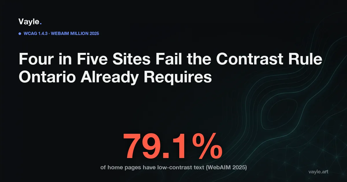
The single most common WCAG (Web Content Accessibility Guidelines) failure on the web is not a missing caption or a broken screen-reader label. It is a text color that does not contrast sharply enough with its background - and according to WebAIM's Million 2025 analysis of the top one million home pages, 79.1% of sites have at least one instance of it, averaging 29.6 low-contrast text failures per page. Under Ontario's IASR (Integrated Accessibility Standards Regulation), meeting the contrast rule at the WCAG 2.0 AA level is not optional for organizations with 50 or more employees - it has been the legal floor since 2014, with the December 31, 2026 ACR (Accessibility Compliance Report) deadline now six months out.
Key facts
- The WebAIM Million 2025 report analyzed the top 1,000,000 home pages and found low-contrast text on 79.1% of pages - the most prevalent WCAG failure for the fifth consecutive year; the average page contained 29.6 instances of low-contrast text (WebAIM, webaim.org/projects/million/2025).
- WCAG 1.4.3 Contrast (Minimum), a Level AA criterion since WCAG 2.0, requires a 4.5:1 contrast ratio between text and its background for normal text, and a 3:1 ratio for large text - defined as 18 point or 14 point bold (W3C).
- Logo text and purely decorative text are exempt from the contrast rule; text that is part of inactive interface components is also exempt (W3C, WCAG Understanding 1.4.3).
- WCAG 1.4.11 Non-text Contrast (Level AA, added in WCAG 2.1) extends the 3:1 floor to the visual information required to identify buttons, form fields, checkboxes, and focus indicators - this sits above the IASR's WCAG 2.0 baseline but is the practical best-practice target for any new build (W3C, WCAG Understanding 1.4.11).
- Ontario's IASR requires organizations with 50 or more employees (and the public sector) to meet WCAG 2.0 Level AA for public websites by December 31, 2026 - 1.4.3 is part of that floor; the AODA (Accessibility for Ontarians with Disabilities Act) has no private right of action, but an excluded user can file with the HRTO (Human Rights Tribunal of Ontario) under the Ontario Human Rights Code.
What does WCAG's color-contrast rule actually require?
WCAG 1.4.3 sets a minimum luminance contrast ratio: 4.5:1 for normal body text, and 3:1 for large text. The ratio is calculated by dividing the relative luminance of the lighter color by the relative luminance of the darker one - a number any contrast-ratio tool produces instantly from two hex values. Black text on a white background has a contrast ratio of 21:1, well above the threshold. White text on a medium-grey background might look readable but test at roughly 3.2:1, which fails for anything smaller than 18-point type.
The rule applies to the text rendered on the page, not to the design file. A brand's "signature" dusty grey or muted teal for body copy might look elegant on screen but fail the 4.5:1 check - which is exactly why this failure is the most persistent on the web despite being among the most fixable.
What counts as "large text" under WCAG 1.4.3?
Large text gets a lower threshold (3:1 instead of 4.5:1) because size compensates for reduced contrast. WCAG defines large text as text at 18 points or larger, or 14 points bold or larger - approximately 24 CSS pixels for 18pt and 18.67 CSS pixels for 14pt, depending on browser and system settings (W3C). Anything below those sizes is treated as normal text and requires the full 4.5:1. A heading set at 24px regular weight is large text; body copy at 16px is not.
Does the same rule apply to buttons, form fields, and icons?
The original WCAG 1.4.3 covers only text (and images of text). It says nothing about whether the border of a text input is visible enough, or whether a grey submit button stands out against a white background.
WCAG 1.4.11 Non-text Contrast (Level AA, WCAG 2.1) fills that gap. It requires a 3:1 contrast ratio for the visual information needed to identify user interface components and their states - in practice: a text input's border against the page background, a checkbox's outline, a focus indicator, a chart's data bars. Note that focus indicators were tightened further in WCAG 2.2 (SC 2.4.11 Focus Appearance, Minimum, Level AA), but both 2.1 and 2.2 non-text contrast requirements sit above Ontario's WCAG 2.0 legal floor, making them best practice rather than current mandates - see how WCAG 2.0 and 2.2 differ for Ontario sites.
Which Ontario businesses does the IASR contrast rule apply to?
The IASR breaks web-content obligations into two thresholds:
Organizations with 50 or more employees (private sector and non-profits): public websites and web content must meet WCAG 2.0 Level AA. This has applied to internet websites since January 1, 2021. The December 31, 2026 ACR is the formal sign-off that your organization has met these current requirements - including the contrast standard in 1.4.3.
Organizations with 1-49 employees: the IASR's web-content obligation is WCAG 2.0 Level A, which does not include 1.4.3 (contrast is an AA criterion). However, if a user with a vision impairment cannot use your site and files an HRTO complaint under the Ontario Human Rights Code alleging discrimination, the Tribunal looks at whether a barrier was created or maintained - not only at which IASR technical tier applies. A business with 30 employees using a color combination that fails 4.5:1 has a potential exposure that the IASR employee threshold does not eliminate.
Public-sector organizations: WCAG 2.0 AA has applied since January 1, 2014; their ACR deadline (December 31, 2025) has already passed.
The AODA carries no private right of action - there is no ADA-style individual lawsuit mechanism under provincial accessibility law. But the compliance-report process and HRTO route are both real; what an HRTO complaint actually looks like is worth understanding if your site's contrast fails.
Why do so many sites still fail this rule?
Because designers and developers typically work on calibrated monitors in lit offices, and color combinations that look fine in those conditions often fail the mathematical threshold. A common pattern: body copy is set in a brand color - muted teal, soft navy, light grey - that tested as legible against white on a print proof but never went through a contrast-ratio tool. Another pattern: a developer uses a placeholder style (color: #aaa on a white background) for error messages or helper text, not realizing that #aaa on #fff produces approximately 2.32:1 - a clear fail.
The WebAIM data puts numbers to this: an average of 29.6 low-contrast instances per page means the problem is woven through most sites, not isolated to one oversight. Because the failures often live in brand-designated color tokens, they reappear on every new page and component added to the site, compounding over time.
Can an accessibility overlay fix contrast issues?
No. Contrast ratios are a function of the foreground and background color values in a site's CSS. An overlay widget injected by a third-party JavaScript snippet has no reliable way to know which text on an arbitrary page is informational versus decorative, or what the actual rendered contrast is between a partially-transparent element and a background image. Overlays cover roughly 30-40% of WCAG failures - and contrast, precisely because it is a computed property of every text element on every page, is one of the areas where automated overlays consistently fall short.
The FTC (Federal Trade Commission) fined the largest overlay vendor, accessiBe, $1,000,000 for falsely representing that its widget brought sites into compliance (FTC, order finalized April 2025). Contrast failures remaining on overlay-covered sites are a documented pattern in litigation data: 456 sites with overlays installed were sued for web accessibility in the first half of 2025. The fix for contrast lives in the CSS - not a script loaded on top of it.
How do you find and fix contrast failures before the 2026 deadline?
The fastest starting point is a dedicated contrast-ratio tool: WebAIM's Contrast Checker (webaim.org/resources/contrastchecker) takes two hex values and returns the ratio and a pass/fail for both AA and AAA, in under a second. Browser DevTools in Chrome and Firefox include an accessibility panel that reports contrast for the element under your cursor. An automated scanner such as Google Lighthouse will flag the most obvious instances in a single pass.
Two practical steps speed up remediation:
Audit your design tokens first. Most sites use a small set of repeating color combinations - brand colors on white, text on tinted backgrounds, grey on grey. Fix the ratio at the token or CSS variable level and the correction propagates everywhere that token is used, rather than requiring a page-by-page hunt.
Test the live page, not just the design file. Background images, semi-transparent overlays, hover and focus states, and dynamically injected text all affect the actual contrast ratio the browser renders. Tools that inspect the live DOM catch failures that a static mockup review misses.
This is precisely the kind of finding a proper accessibility audit surfaces and documents - giving you dated evidence for your ACR and a defensible position if a complaint is ever filed. The same ACR you file by December 31, 2026 is the document that records whether your WCAG 2.0 web obligations - contrast included - are met; what the compliance report actually covers explains what you are certifying.
If you want a second pair of eyes on your site, send it to me and I will tell you what I would fix first and what it would cost, the same working day.
Vayle is a remote-first accessibility-engineering studio serving Ontario. General information, not legal advice.